top banner

header icon Pages and Page Types

In this section we are going to discuss the "Pages" application and go over "Page Types"

Pages Application

Pages Application is divided into two main sections: the content tree (on the left frame) and the viewport (the right frame). 

  • The Content Tree (in blue rectangle below): this is a repository of page types that make up the content of the website. When an item is clicked it will display in the viewport (in purple below)
    • Page Types: elements that are contained in the content tree that represent content on the site. Page types do not necessarily have to be traditional pages of a website they are all the elements that make up pieces of a page. It is helpful to think of page types as content, containers of content, as well as pages. 
  • Viewport tabs (in red below): Page, Content, Properties will display different content selected from the content tree differently depending on how the page type is structured. For traditional content pages content is editable on the “Page” tab with the page builder and widgets. For page types that are pieces of content editing is done on the “Content” tab. Please note: some pages may have content that is editable on all three tabs. An example of this is seen on traditional pages where the content edited on the “Page” tab, the title and template edited on the “Content” tab and the URL and metadata is edited on the “Properties” tab. 


Content Tree

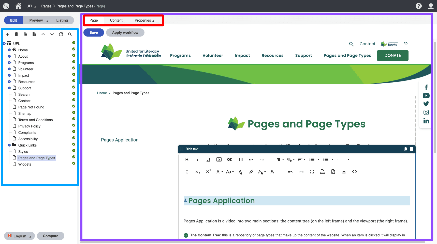
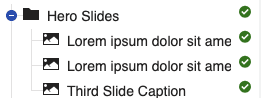
The content tree represents the page types that make up the website. To change the placement of any item you can drag and drop items. The sequence that you page types appear in affects their order. For example if you want a slide to appear first on the website then you would move it up in the content tree

Notes:

  • The red "X" or green checkmark icon indicate if the page type is published. Publishing settings are found on the "Content" tab for the page type.
  • The greyed out "A" icon indicates that the page type is available in a different culture. To publish it in the current culture you need to click on it and copy over the contents with the prompts or create a new page type.
  • To switch a culture: go to the button that says the culture "English" or "French" and a option to switch will appear
  • Adding elements to the content tree is done by clicking the little "+" sign in the top left corner. When you click this button you will see a dialog of page types that you can add to the site. 

Viewport Tabs

The viewport tabs are seen at the top of the viewport. Depending on the page type will see different tab options. The "Page" tab is added for page types that have a page associated with them. Page types that do not have pages associated with them do not need a "Page" tab because they are just containing content to show on a page. The Page tab and Page builder is documented here.


Content Tab:

Every page type has a "content" tab. This tab is where you enter information. 

Here is the content tab for the "Hero Slide" page type:

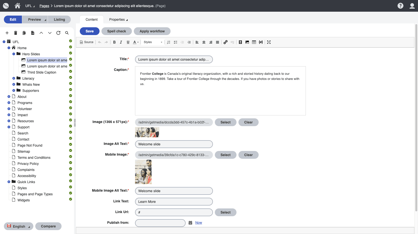
You will notice the option for uploading images for the slide as well as the content and link. 


Here is what the content tab looks like for a "Content Page" page type:


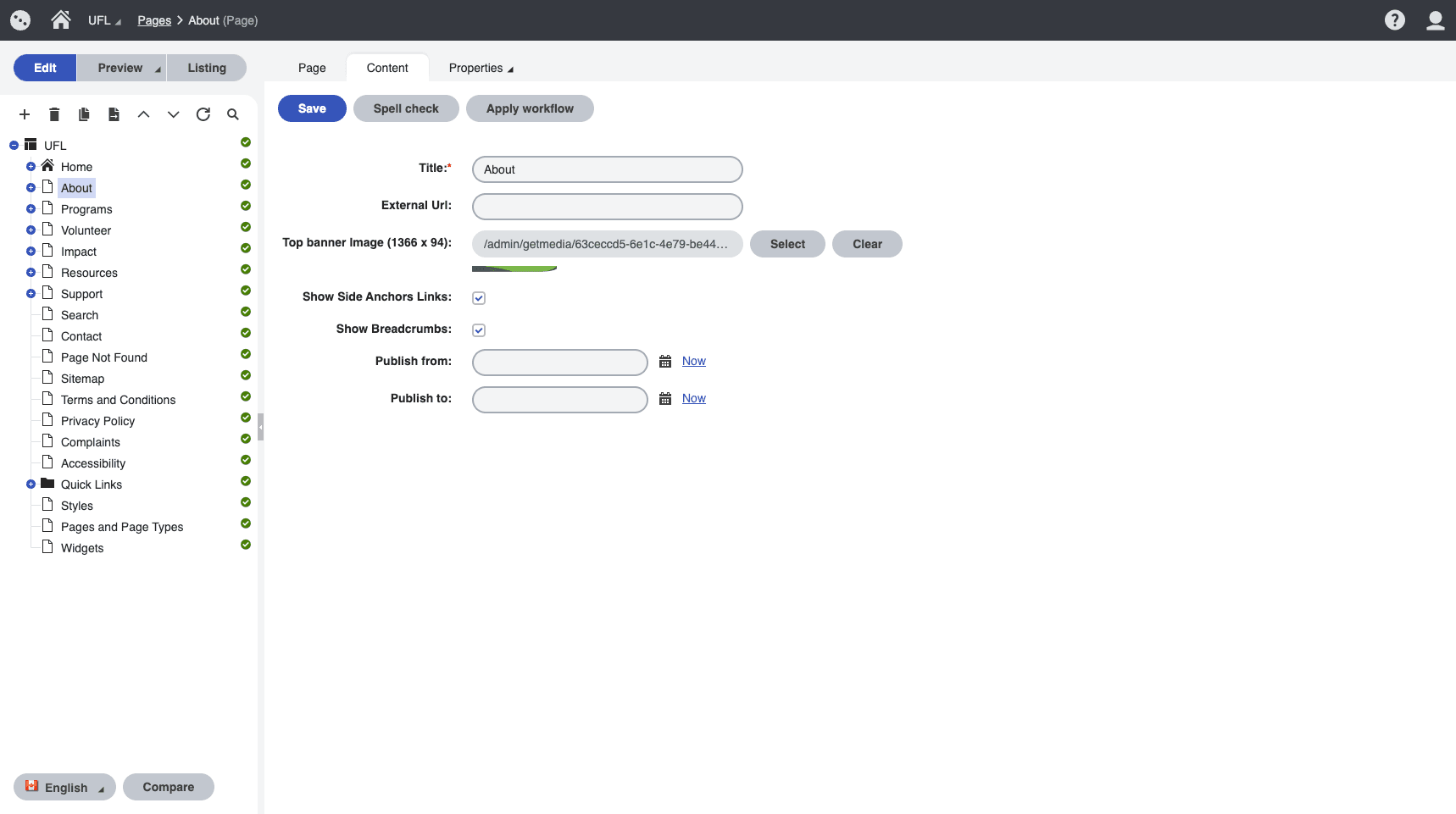
Notice that the "Page" tab is available for this page type and not the "Hero Slide". 

The settings on the content tab for this page type allow you to:

  • Name the page
  • Add an external URL (this is in the case you want this page to redirect to an an external website)
  • Set the banner image (it defaults to what is shown)
  • Show Side Anchor Links: if this is not checked then the page will not have anchor links
  • Show breadcrumbs: if this is not checked then the page will not show breadcrumbs
  • Publish From and To: these are publishing properties on all page types. Set the "Publish To" to "Now" to unpublish any page type

Properties Tab

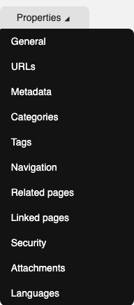
The properties tab includes some valuable information for content editing:

  • General is used for general page information. Created date, page type are used most frequently 
  • URLs is used to add redirects for a page. If you have a URL that you are using for marketing you can add it as an "Alternative URL" and it will redirect, provided that the base url is the same as the website.
  • Metadata is used to add title and descriptions to pages
  • Navigation includes an option to show or hide a page from the menu. Make sure you uncheck this if you are creating a page you dont want added to the menu

Page Types

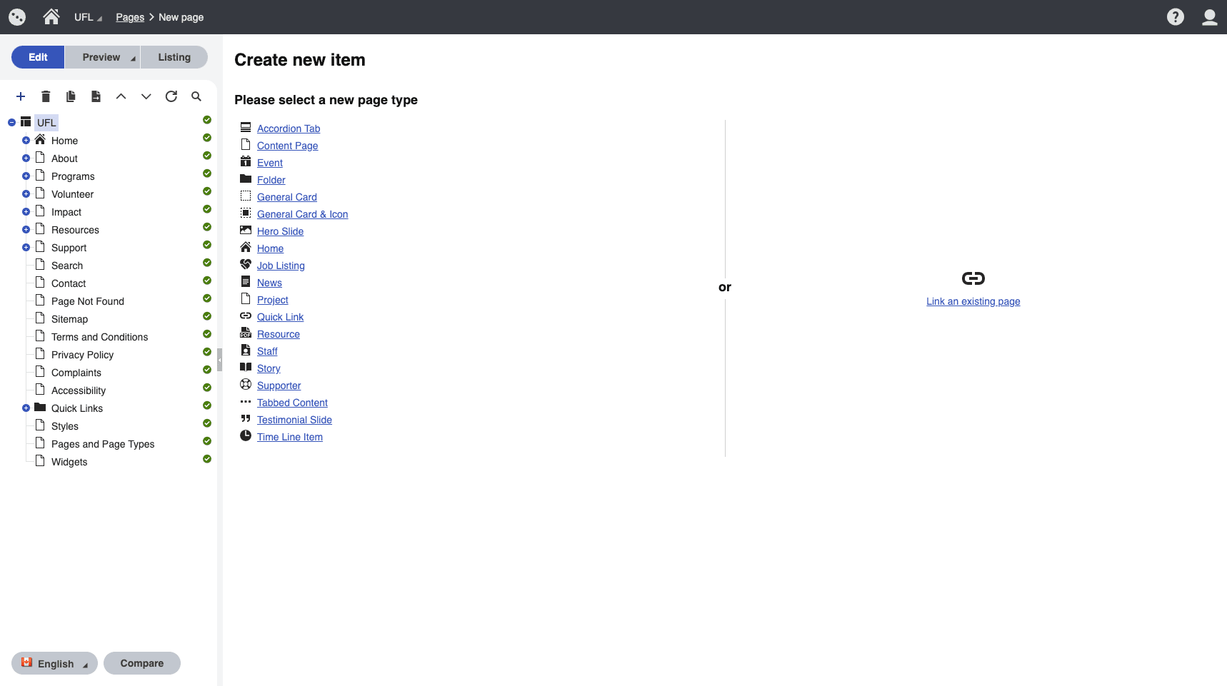
To add a page type click the "+" above the content tree. From there you will see a list of page type options for the section of the content tree you have selected. 


Page types:

  • Accordion Tab: this is a tab that connects to the accordion widget
  • Content Page: used to create a new page on the site
  • Event: used to create a new event
  • Folder: used to organize page types on the content tree. Best practice is to make the folders the child page types to the page you want to reference page types from. This will make more sense when you start referencing the page types with widgets.
  • General Card: used to create a general card and referenced with the general card widget
  • General Card Icon: used to create a general card with icon and referenced with the general card icon widget
  • Hero Slide: used to add a slide to the home page slider
  • Home: used for the homepage
  • Job Listing: used to add Jobs. This Page type includes a Page Tab
  • News: used to add News. This page type includes a Page tab
  • Quick Link: used to add footer and header items
  • Resource: page type to add a resource
  • Staff: page type to add Board and Staff members
  • Story: page type to add inspirational stories
  • Supporter: page type to add logos 
  • Testimonial Slide: used to add slides. used with the testimonial slider widget
  • Time Line item: used to add to the Our story timeline page


You will see by navigating the content tree how certain page types are organized in folders. In order for these page types to show up on the site they need to be referenced by widgets. 

To learn about widgets click here

Facebook YouTube Instagram LinkedIn